

Context
The store still read like a single-brand retail shop. The business behind it was something else — a distributor holding stock in Ontario and supplying independent retailers, with more brands to come. Retailers had to work that out for themselves.
We began with a discovery review of the site, its search visibility, its analytics and its product data, then rebuilt the storefront so that position was the first thing anyone saw, whether they came to buy a pen or to stock a range.
- Brand direction, new logo and style guide
- Full Figma design across desktop and mobile
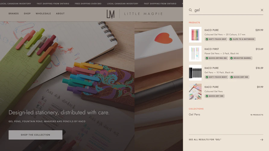
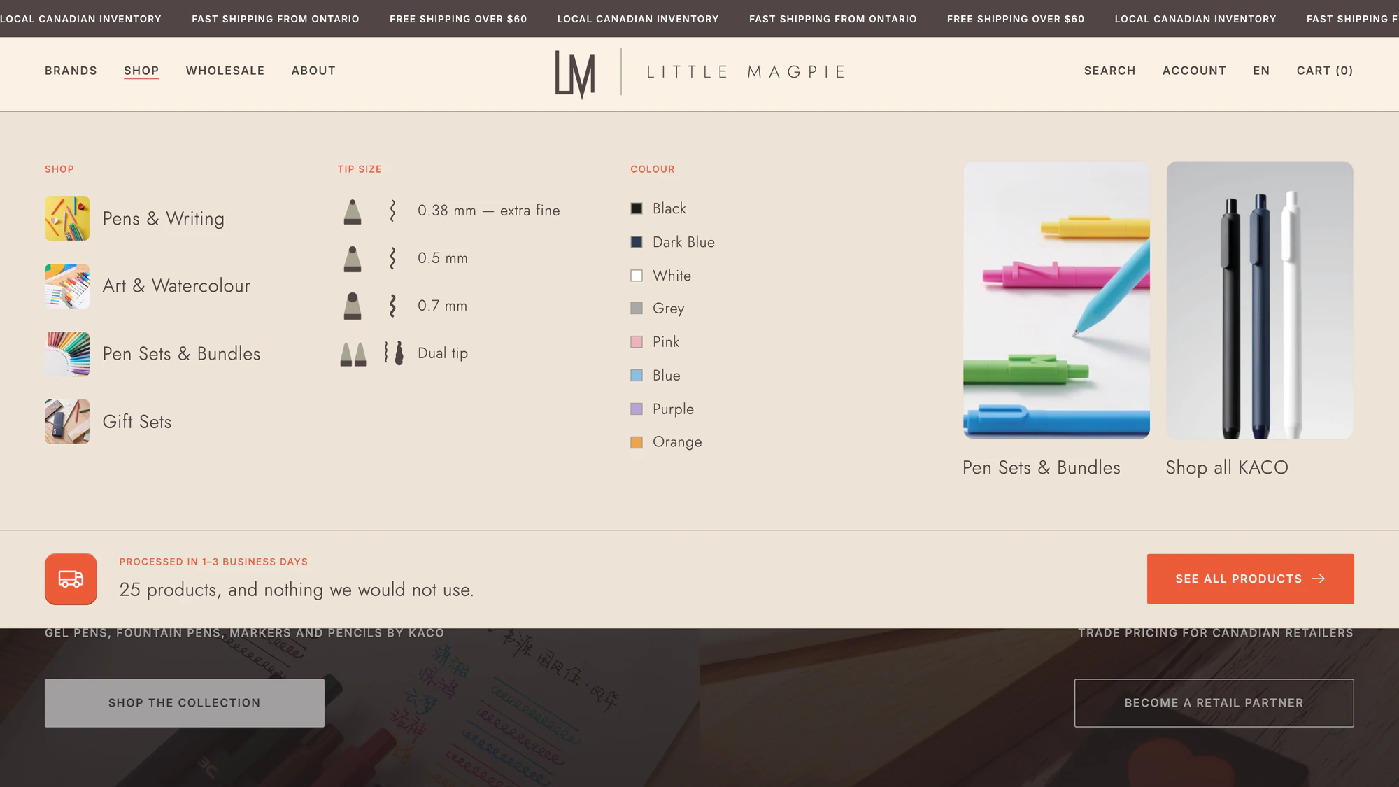
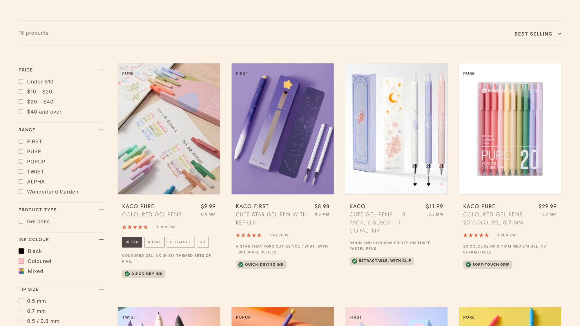
- Collections by category and by brand
- A complete wholesale journey and trade enquiry
- English, French and Chinese throughout
- Product catalogue reviewed and normalised
Two Front Doors, Room to Grow
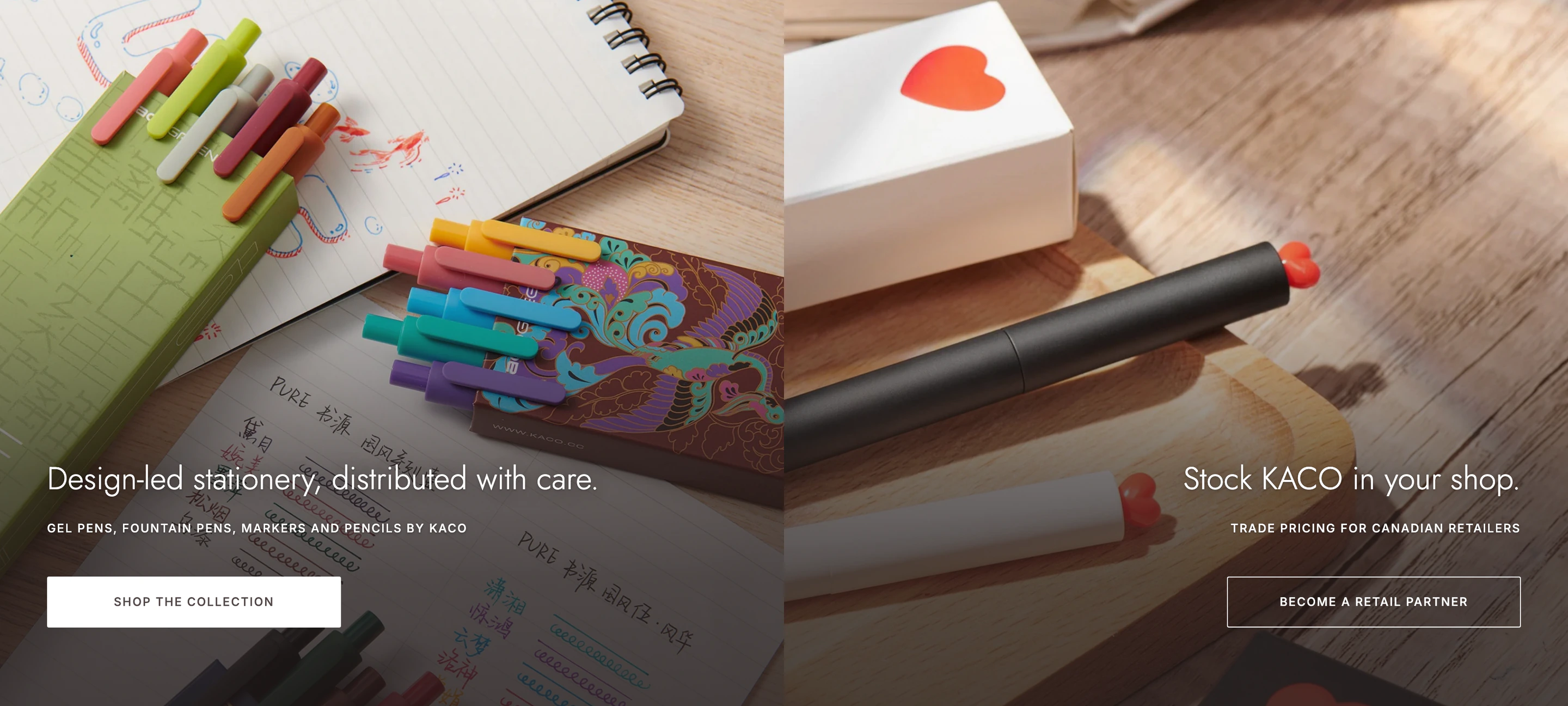
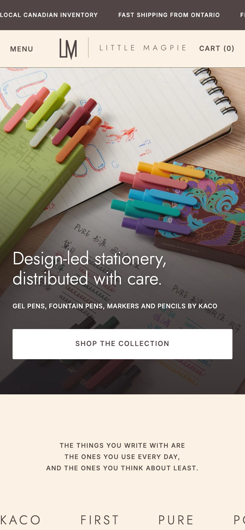
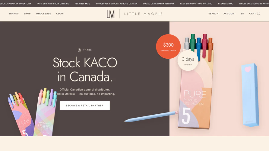
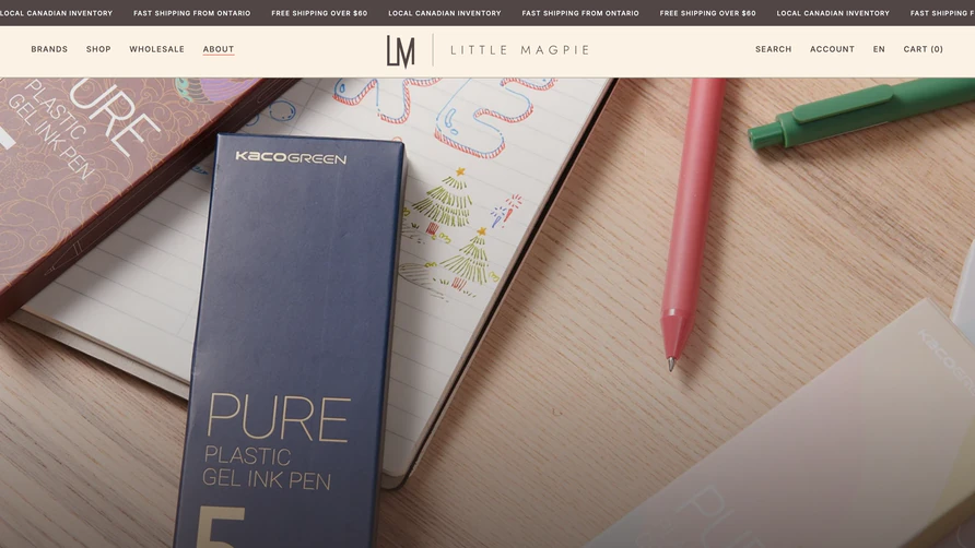
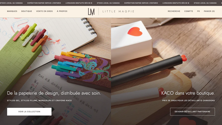
The homepage opens on a split: design-led stationery for shoppers on one side, trade pricing for Canadian retailers on the other. Each audience sees its own door in the first second, and neither has to scroll past the other to find it.
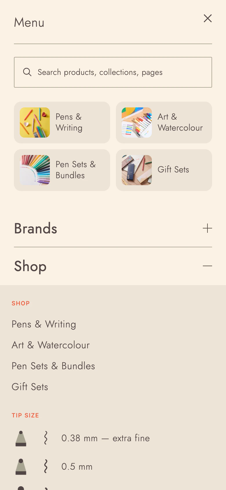
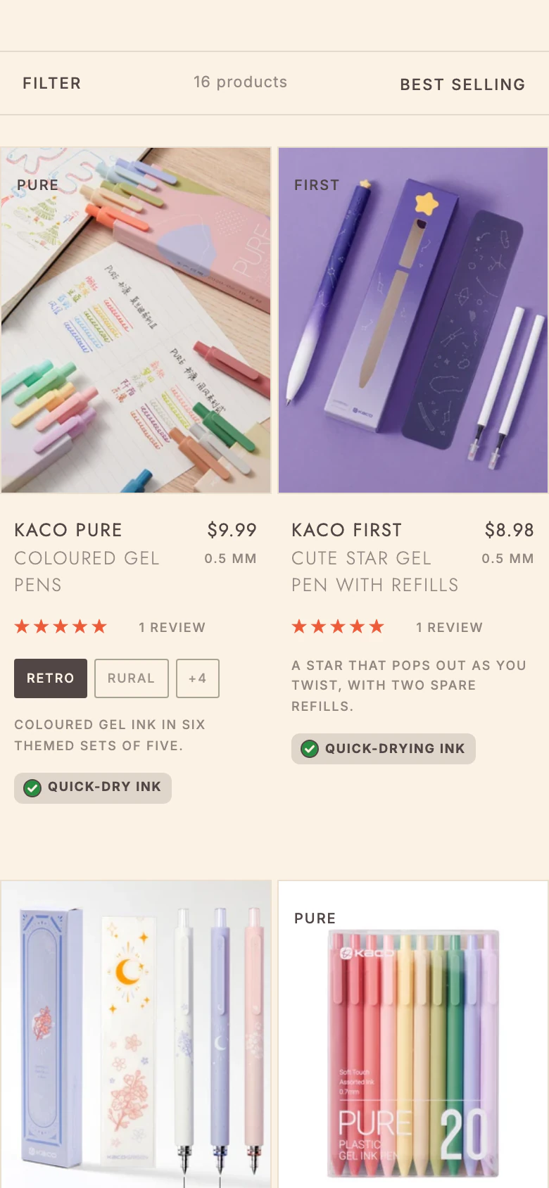
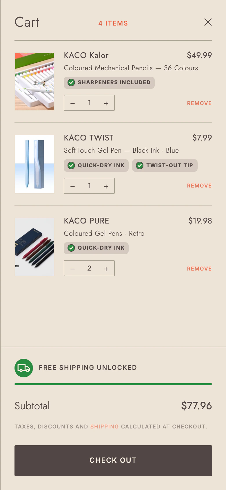
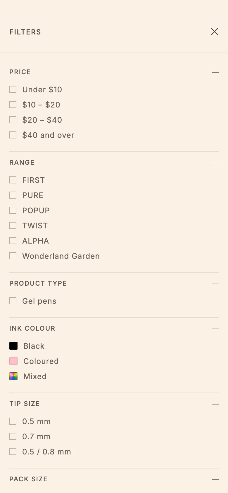
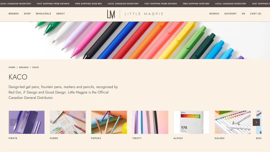
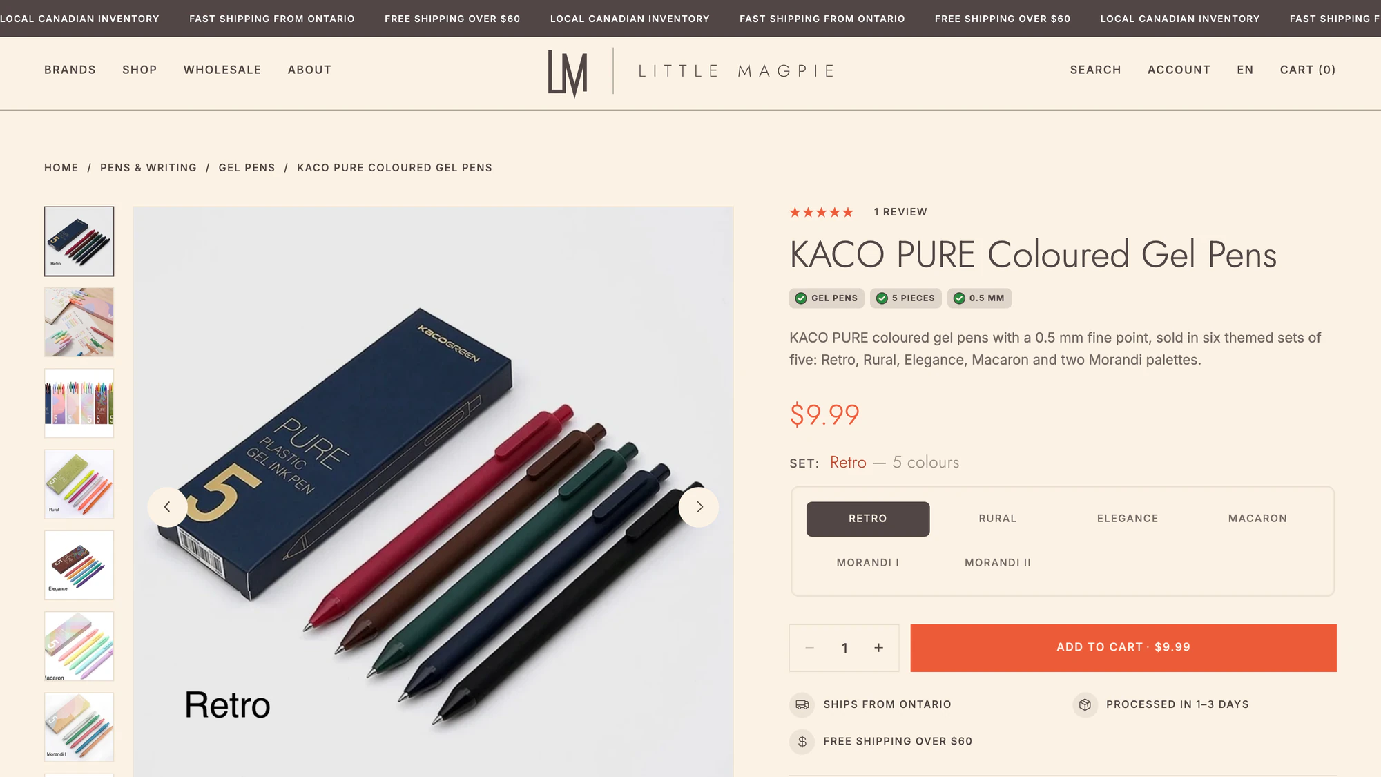
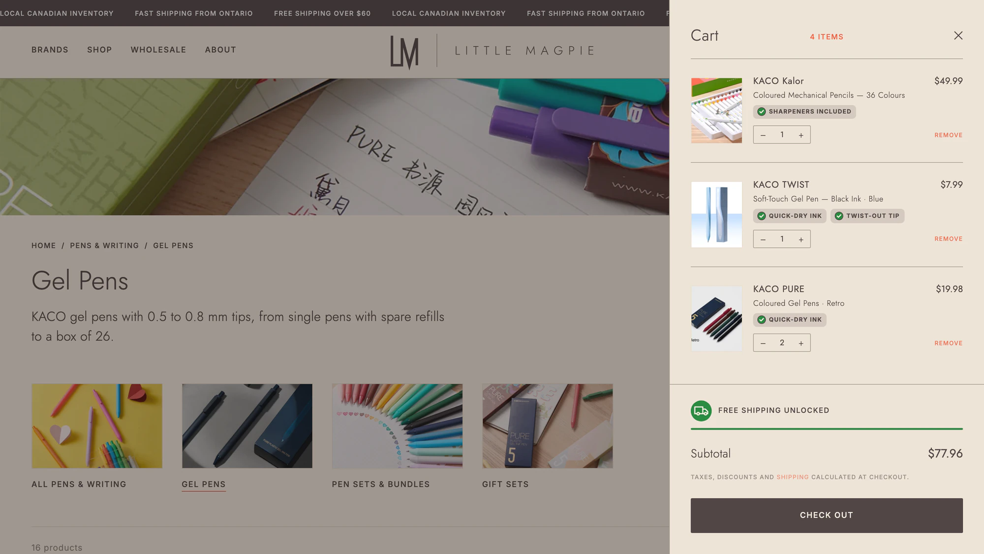
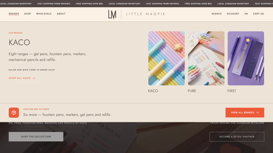
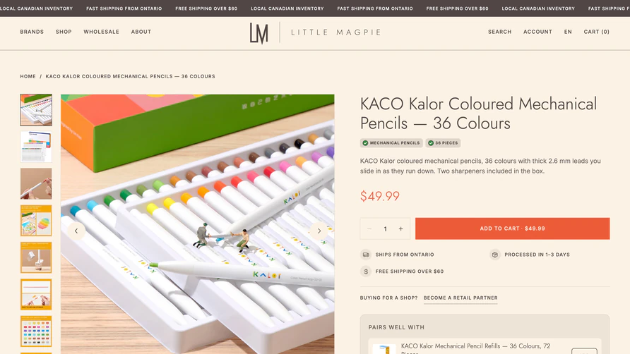
Behind that, the catalogue works two ways at once. Collections run by category — gel pens, art and watercolour, gift sets — and by brand, so adding a new brand becomes a content task rather than a development one.
A dedicated brands page states the principle plainly: one brand today, more to follow, each chosen with the same care. The navigation was restructured around that, so the store can grow without being rebuilt again.
A Wholesale Journey in the Order Retailers Ask
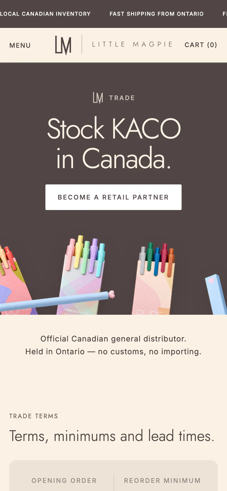
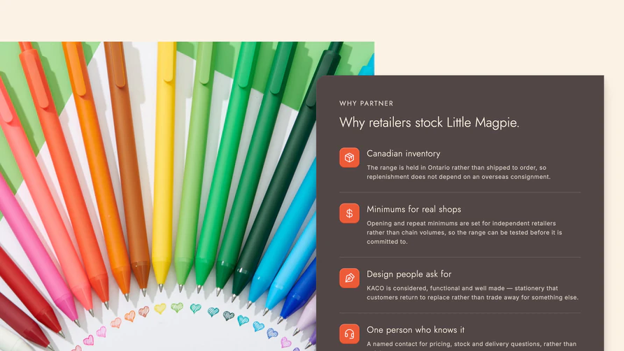
A single enquiry form asks a retailer to commit before they know anything. The rebuilt wholesale page answers their questions in the order they come up: what the terms are, what it costs to start, how long delivery takes, and how ordering works.
Opening order, reorder minimum, lead time, shipping and payment sit together in one panel, before any form. The path from enquiry to first delivery is set out in four steps, and retailers choose between three equal routes: order direct, order through Faire, or download the catalogue.
The trade enquiry asks what a distributor actually needs to know — business details, current range and preferred ordering method — so the first reply can be a useful one.
Three Languages, Built In
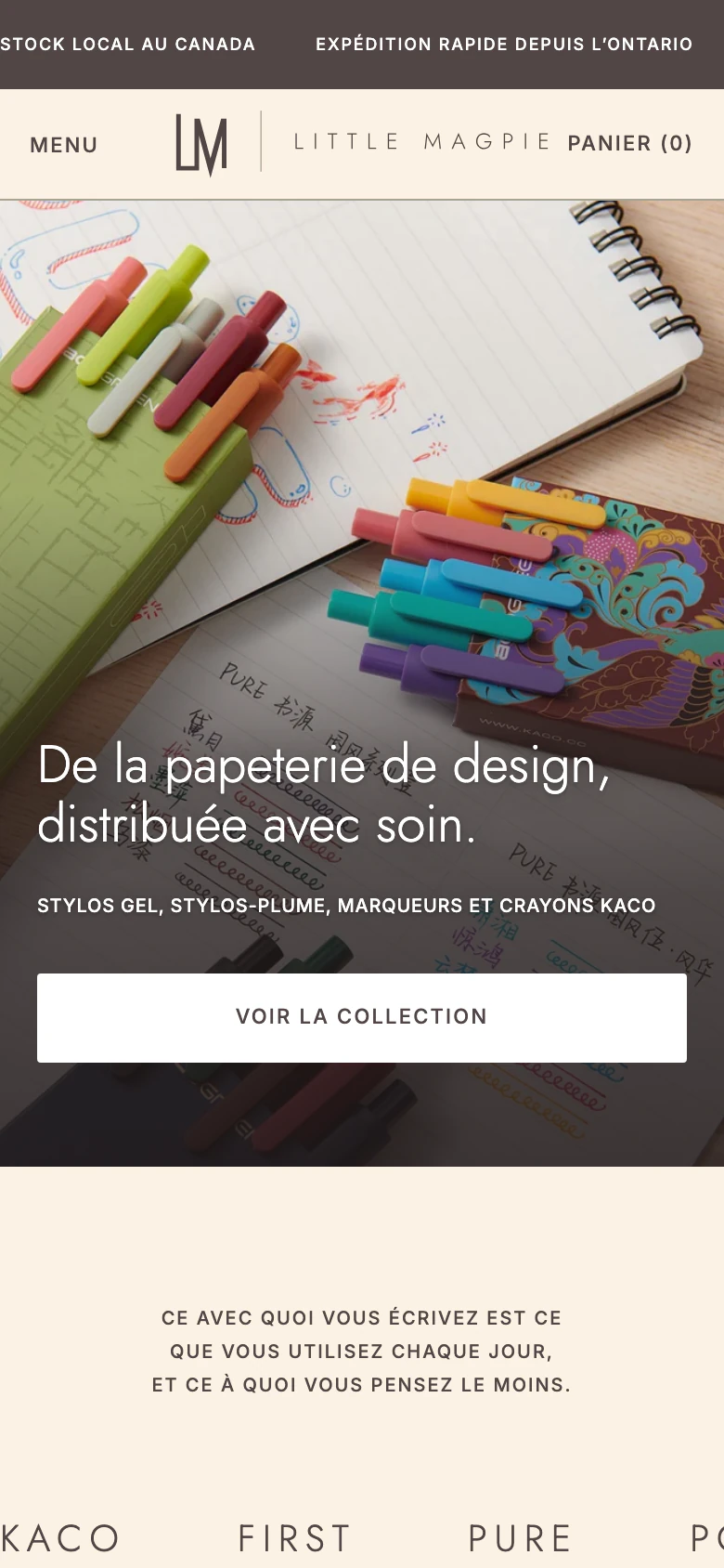
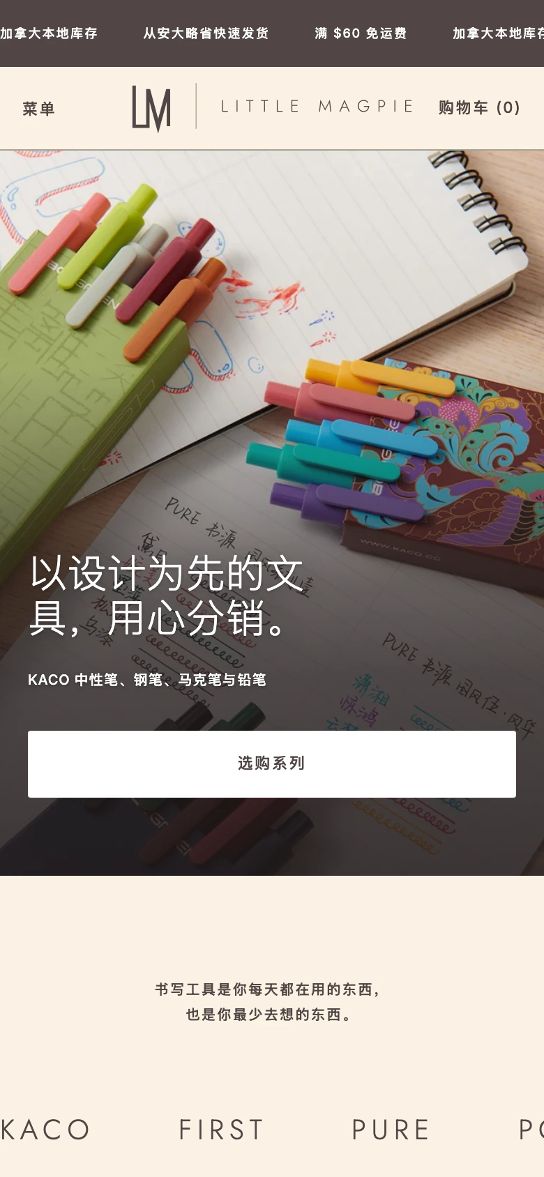
The rebuild runs in English, French and Simplified Chinese: language switching, localised URLs, hreflang and layout, built into the theme from the start rather than bolted onto one language afterwards.
The layout holds in every language — the French homepage and the Chinese one keep the same structure and the same clarity — so a retailer reading in their own language is not reading a lesser version of the store.
A Catalogue That Tells the Truth
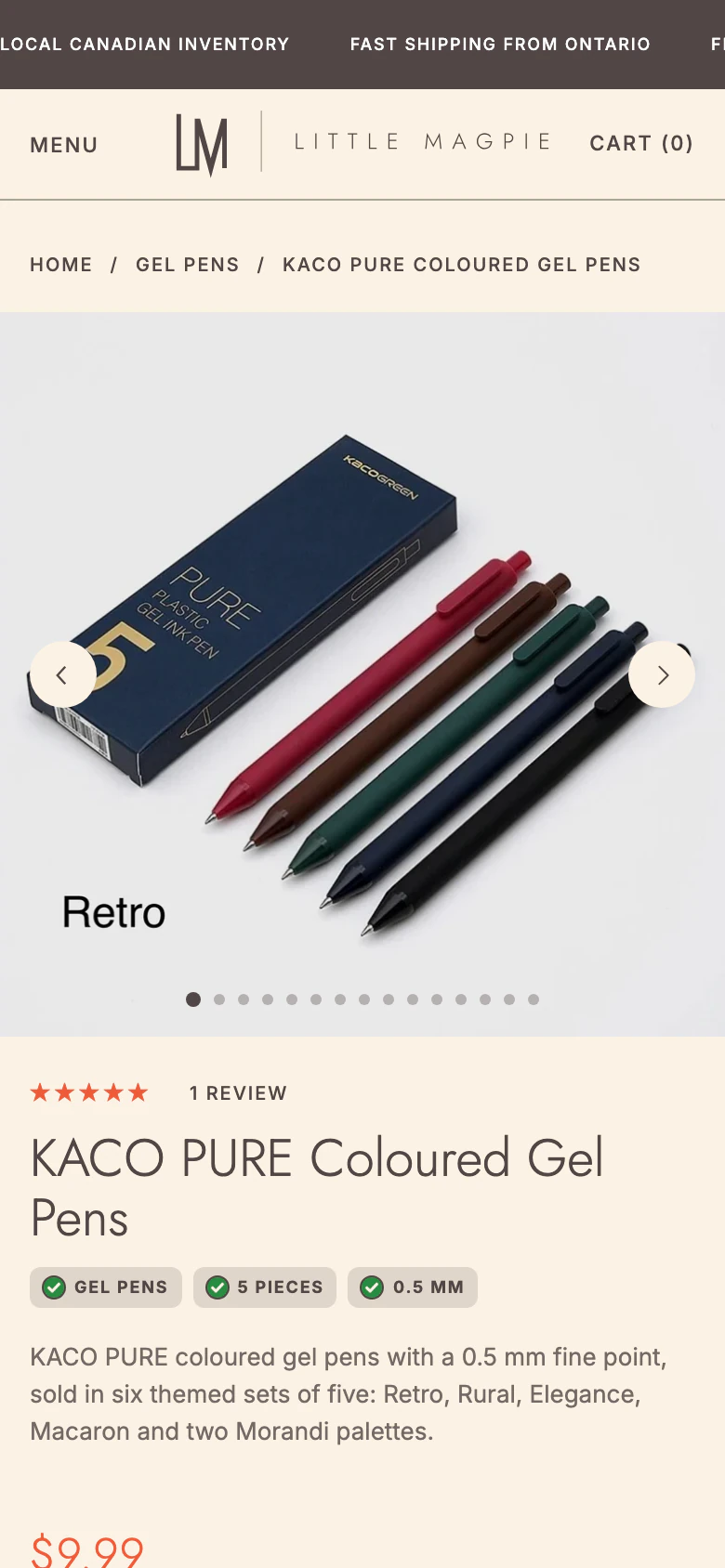
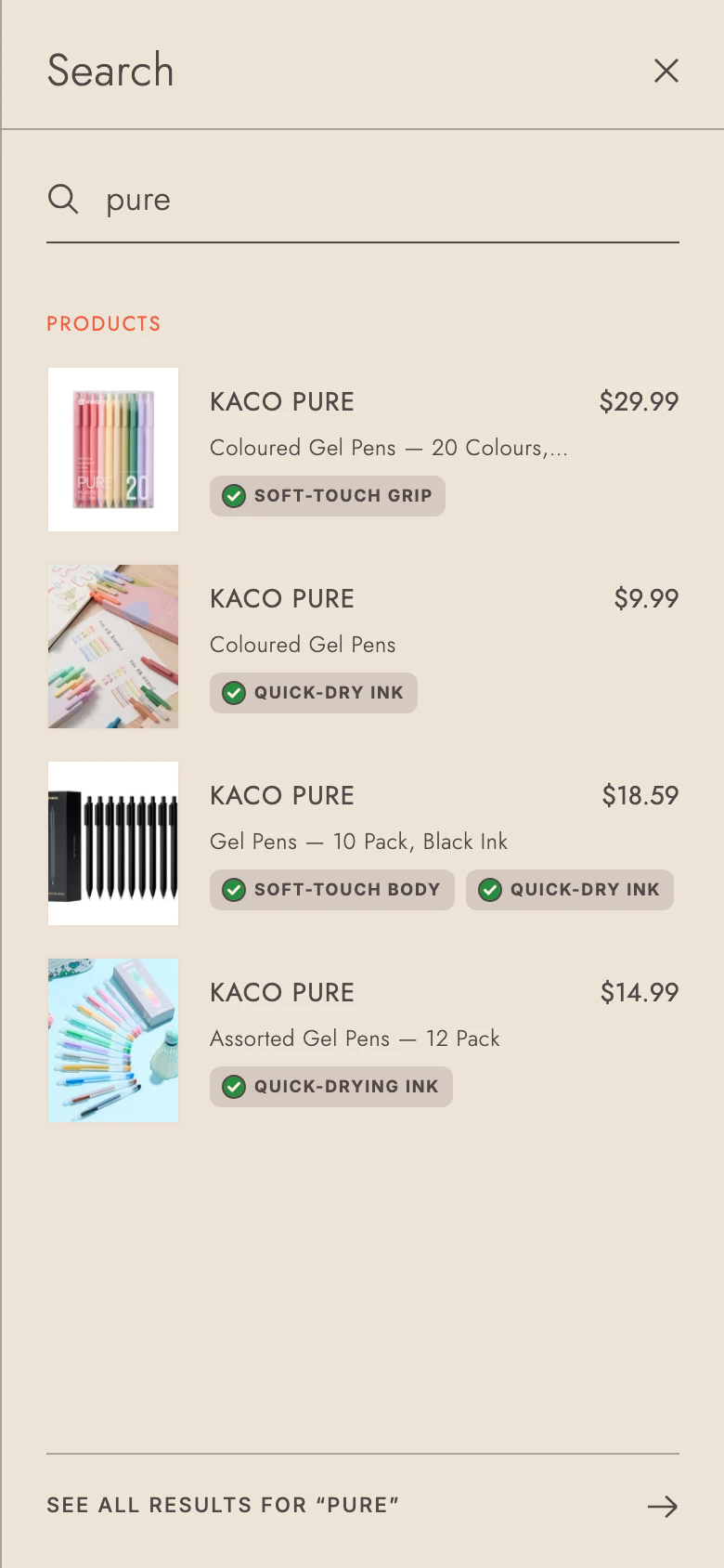
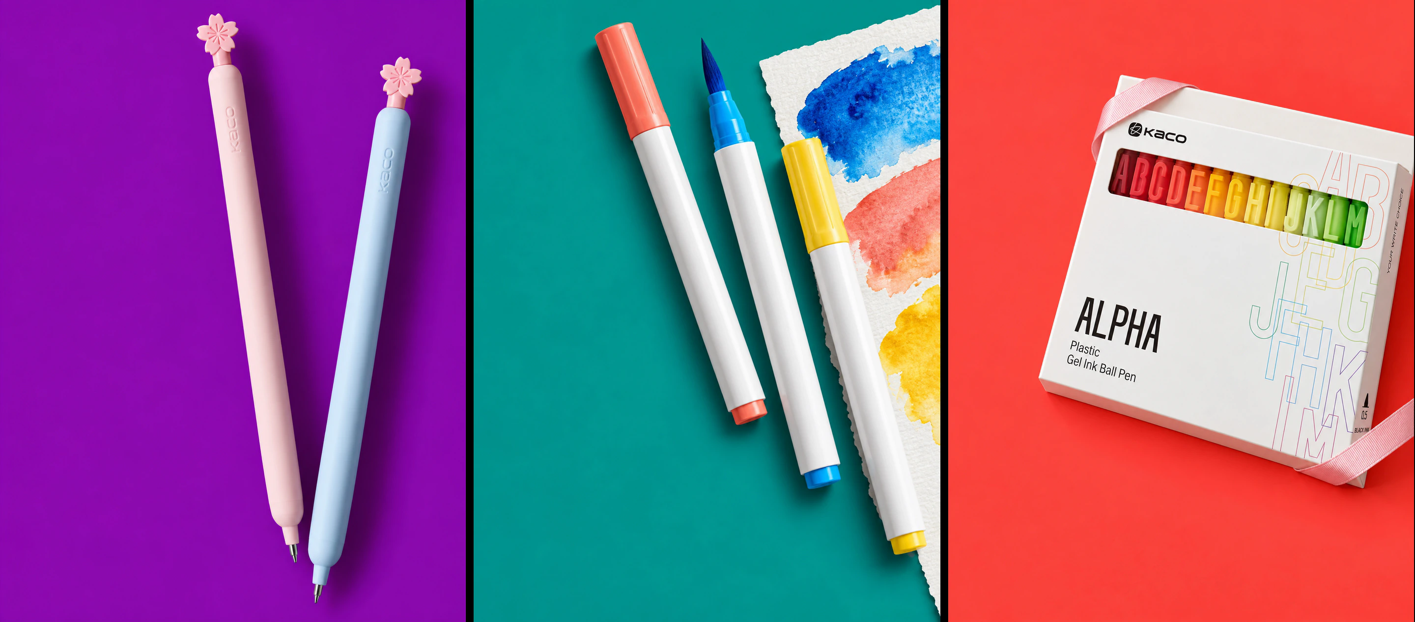
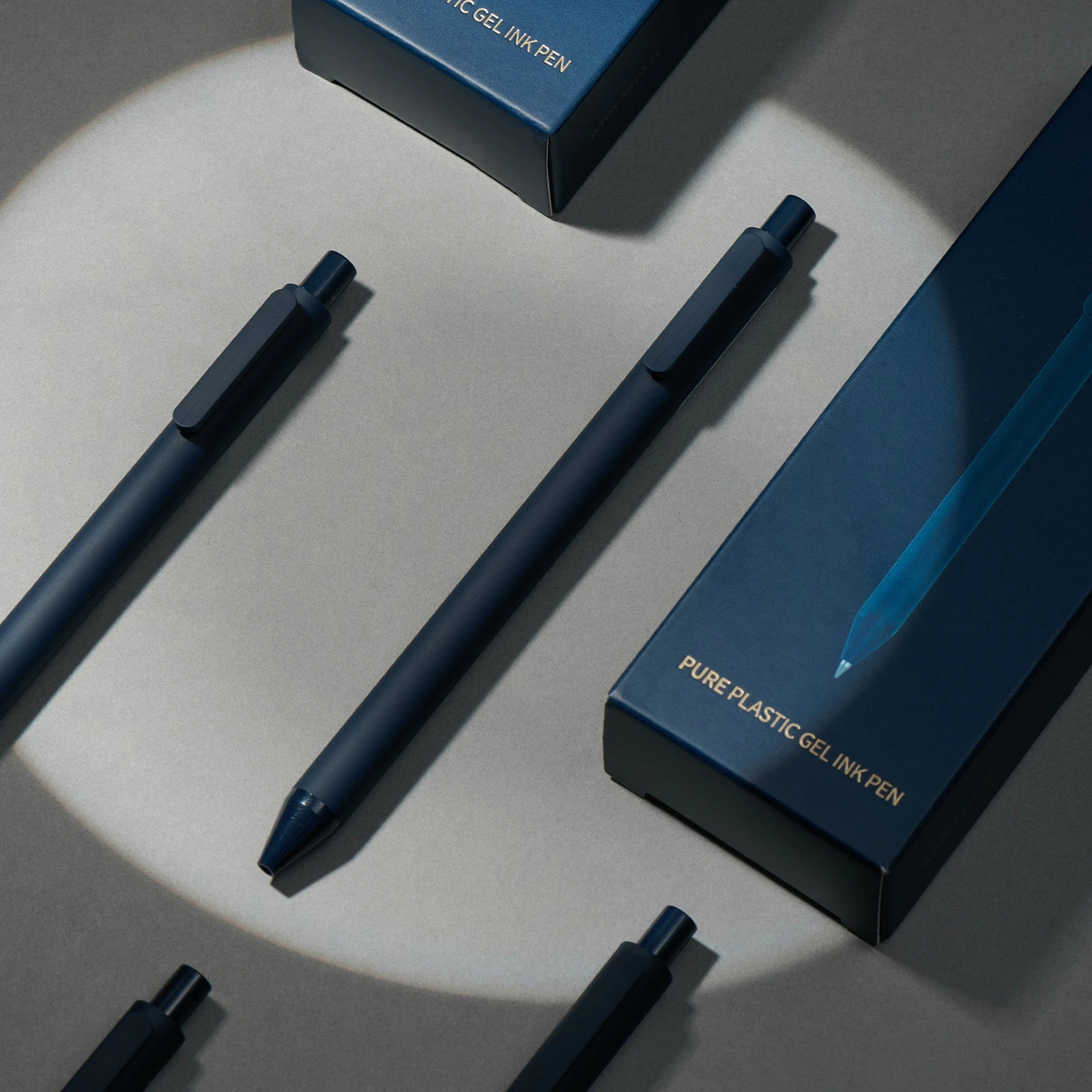
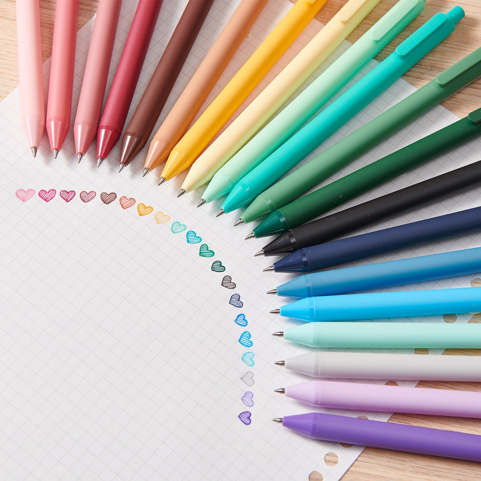
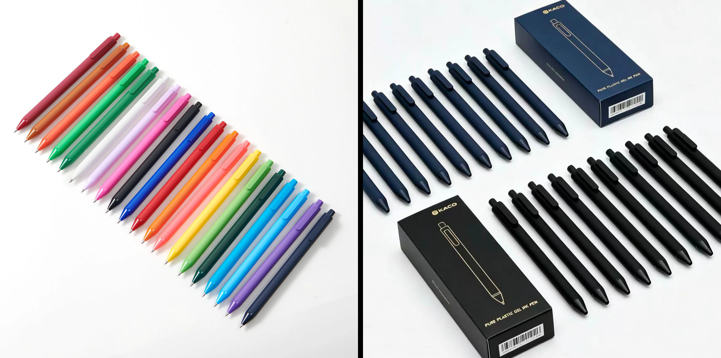
Before launch we reviewed every product: all 237 photos checked, every product renamed to one consistent convention, and duplicate listings merged into single products with variants.
The review caught images that contradicted the product in the box — a tip size that did not match, a colour set labelled with the wrong name — so they could come off before a customer relied on them. For a distributor, getting the product right is the product.
In partners we trust
Shopify
Faire
Figma
Our value added
We rebuilt a single-brand retail shop as a Canadian distributor that retailers can understand at a glance and shoppers still enjoy — in three languages, on a structure built to grow.
New identity
Logo, brand direction and style guide
Two audiences
Retailers and shoppers, each with their own door
Multi-brand
Collections by category and by brand
Three languages
English, French and Chinese throughout
Full trade journey
Terms, four steps and three ways to order
237 photos checked
Every product renamed, duplicates merged